
In terms of visual appeal, there is not much that can be said for overstuffed PowerPoint slides. Harmoniously placed content encourages the eye to flow naturally over the graphic elements, enhancing both interest and retention. In this article, Rick Carruth walks us through a step-by-step method for creating a grid in Adobe Illustrator that can be used in PPT.
1. Create an Artboard
Start by creating a new file in Adobe Illustrator. Be sure to enter dimensions for the artboard that mirror those of your future PPT presentation. PPT’s default options are 4:3 (10x7.5) and 16:9 (10x5.63). In this example I’ll be using 4:3 (10x7.5). Once you’ve created a new file according to these specifications, click “Create.”
2. Cover the Artboard
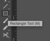
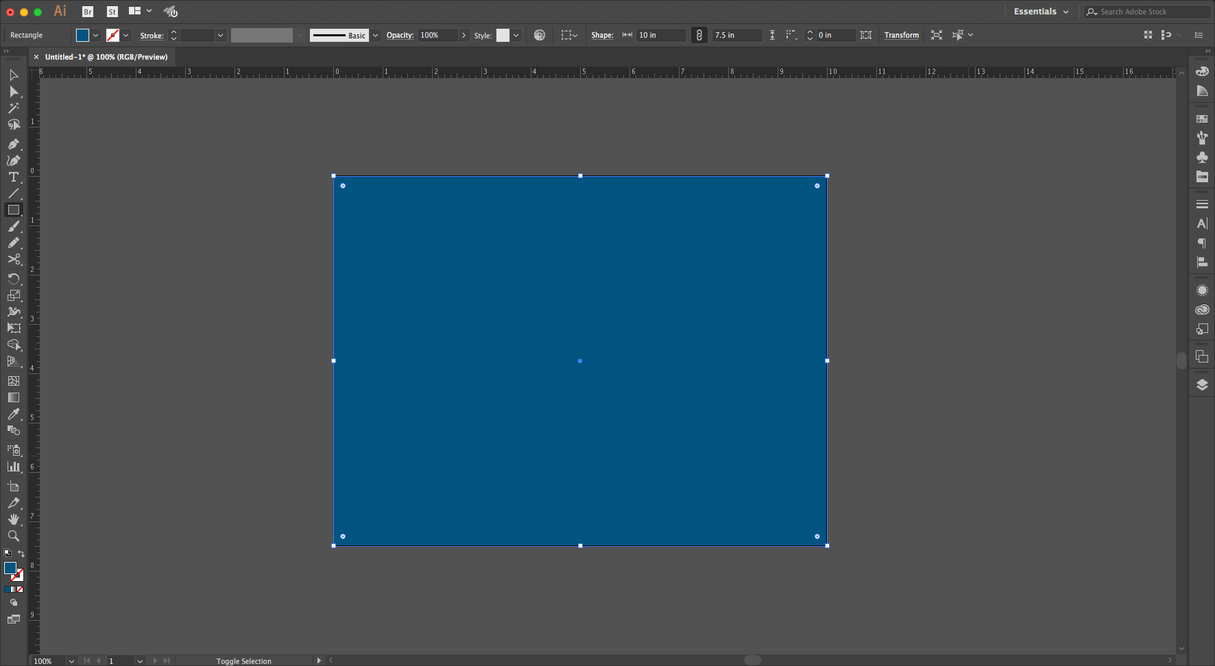
Select the Rectangle Tool from the Tool Panel. Alternatively, you can use the Hotkey (M). Using the Rectangle Tool, cover your artboard with the color fill of your choice. I do not recommend using white or a grey similar to that surrounding the artboard, as this could lead to some confusion in subsequent steps. After you’ve covered your artboard, select the rectangle you just created.
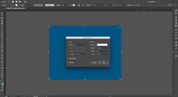
3. Split to Grid
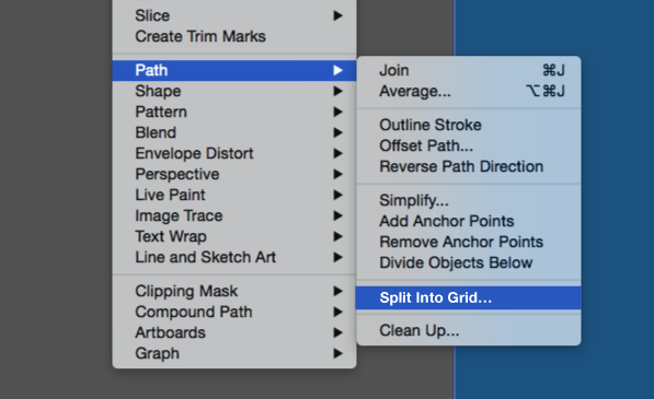
With your rectangle selected, go to “Object” on the Menu Bar and hover the cursor over “Path” from the drop-down menu. While hovering, a new menu will appear. Select “Split to Grid”. A new window will appear with the various grid options you can select to build a grid that best suits your needs.
4. Set Grid Options
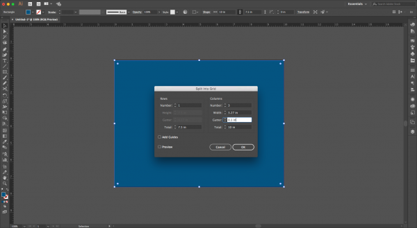
Here’s where it gets fun. The options for creating rows are on the left side of the window, and the options for creating columns are found on the right side of the window. For most purposes you’ll only want to have one row, so we’ll leave this section alone or input “1” in the “Row” field if it isn’t already there. In the columns section on the right, input the number of columns you want for your grid. For the purposes of this example, I’ll be using three, but you can choose as many or as few as you like. Two columns is probably a good default for most basic presentations. Next, we’ll look at the column width. This option is automatically populated by the number of columns you chose to input and doesn’t account for any spacing between your columns. This leads us to the next option, “Gutter.” The gutter is the space between columns that allows for breathing room between the different pieces of content (e.g., text, images, etc.). Selecting a good gutter size really depends on your line length, font size, leading (the space between the lines of text), and other font and paragraph properties. A good general rule is to have your gutter size be slightly over or about double the size of your leading. There really isn’t a right or wrong size, but you don’t want it too thin or too wide; in either case, the viewer could easily become distracted or the natural flow of the presentation could be affected. I’m going to choose “0.1”. This specification isn’t a default number by any means, so feel free to experiment. Once you’ve selected the gutter size the “Width” and “Total” fields automatically update with that information. Another option is a checkbox that allows you to make guides out of your selection, but we will be using a different method to do this in Step 5. Select “OK.”
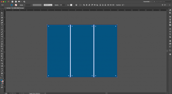
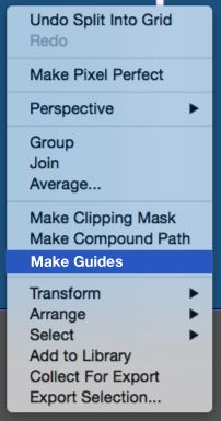
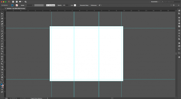
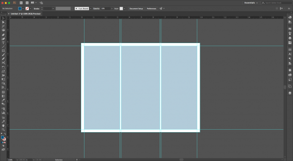
5. Make Guides
Once you’ve clicked “OK” you’ll see that the rectangle you drew earlier has been split into a grid. Select the grid and right-click your mouse. A drop-down menu will appear; select the “Make Guides” option. This will remove the color-filled columns used to create the grid and replace it with guidelines that are more traditional than those that would have been created had you clicked the “Add Guides” checkbox in the “Split to Grid” options window. You can drag out guides from your rulers to extend beyond the artboard if that is more helpful to you.
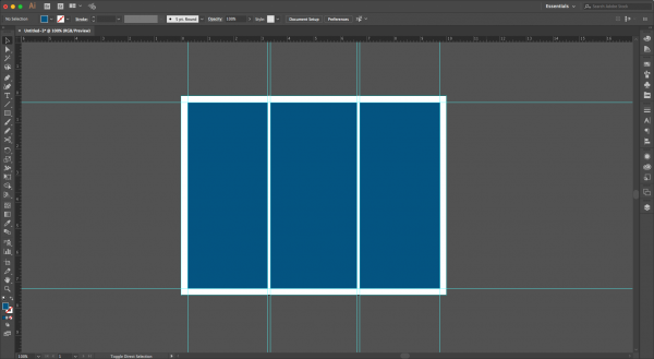
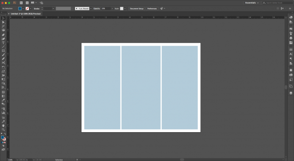
6. Customize the Grid
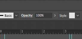
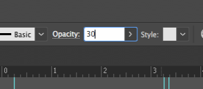
The grid is in place, but there a couple of more things to do before placing it into PPT. First, differentiate your columns from your gutters and use the “Rectangle Tool” again to fill in your columns/content area with another color — I like blue. Once your columns/content areas filled in, you’ll want to lower the color opacity so that you can see your content when using the grid as an underlay. Keeping the column fill colors at 100% opacity can make it difficult to set up and review your content when developing your presentation. Select your columns/content area (all of it) and go to the top “Object bar” in Illustrator. Select “Opacity” and set it to around 30%.
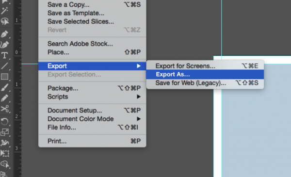
7. Save the Grid
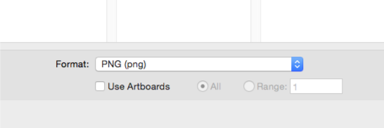
The last step in Illustrator is to save your grid as an image and import it into PPT as you would any other image. Select “File” from the Menu Bar and hover over “Export.” A drop-down menu will appear; select “Export As” from this menu and then select the save location and file type. A .png or .jpg file type are good options.
8. Add the Grid to PPT
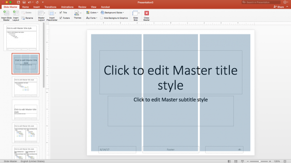
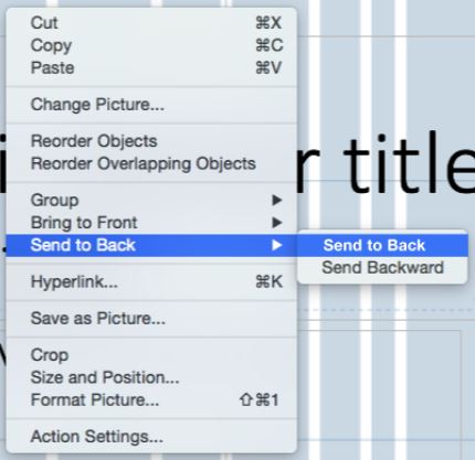
You can now insert the image of the grid into your PPT presentation’s Slide Master. The grid image should be exactly the right size, without any need for scaling to fit. You’ll need to arrange the grid image to be in the very back of the Slide Master so that all of your content rests on top of the underlay. In the Slide Master, right-click the image. A menu appears with the option “Send to Back” — select this option. When building your presentation in Normal view, you’ll be able to freely arrange your content within the underlay. Next we’ll…celebrate because you’re all done! Once you’ve laid out your content within the confines of the grid, take a moment to admire your beautifully organized presentation.
To make things easy for you, here is a grid underlay that I’ve created which can be placed into a PPT presentation for your use. With this grid you’ll be able to quickly begin laying out a presentation with anywhere from 1-6 columns. Keep in mind that the gutters may need to be adjusted to fit your specific presentation’s content. To do this, you can scale down the width of your text boxes as needed to create uniform spacing between your columns.