Recently I’ve found myself furthering my knowledge of the Golden Ratio and its proportions, specifically as regards logo design. If you’re not familiar with it, the Golden Ratio is a mathematical equation which states that (A) divided by (B) is equal to the sum of (A) and (B), divided by (A), and results in the number 1.618. Math is…not really my thing, but luckily we don’t need to focus on that because people a lot smarter than I am have it all figured out. What’s important from the design perspective is that it works – every time. This ratio has been used in works as disparate as the Mona Lisa and the Parthenon. It’s also found widely in nature, from the Milky Way Galaxy to common flowers, up to and including the human face. The proportions derived from the Golden Ratio are said to be the most visually pleasing to the human eye, so when I decided to have a little fun and play around with the Obsidian Learning logo, I started there.
Obsidian’s original logo was not necessarily designed with the Golden Ratio in mind. This doesn’t mean there’s anything really wrong with it; it’s served us quite well, and I’m not trying to say that a design is automatically lacking if it doesn’t meet Golden Ratio proportions. What it did mean in the case of the Obsidian logo is that it could be improved upon, and because Obsidian’s logo is based on a circle and a few curves it lends itself particularly well to an adjustment passed on Golden Ratio proportions. Keep reading to find out how I took our logo from olden to golden (no groaning, please)!
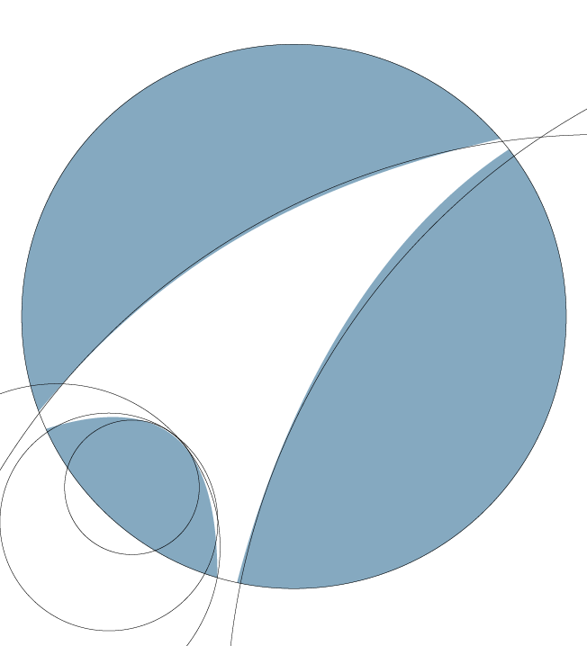
To get started, look at this example of the Golden Ratio and its proportions as used in the update of Obsidian Learning’s logo. This particular ratio was derived from the diameter of the logo’s orb.

Now let’s look at the present, or non-golden, orb. We’ll be comparing this orb’s curves with the different curvatures pulled from the Golden Ratio. We’ll align them as closely as possible to see how this orb stacks up against the curvatures we pulled.


By assembling the golden curves against the original orb’s outlines we can see that it just doesn’t line up 100%. This inconsistency is what needs to be corrected to achieve the look we want.
Voilà! I present to you the re-shaped, “golden” orb constrained to the curvatures of the golden proportions. The inconsistencies have been corrected and we now have a new orb that is well-balanced and more pleasing to the eye. I’ve also made a few design tweaks to make the logo more recognizable, such as enlarging the openings within the negative space; this slight alteration also allows the logo to hold up well at smaller sizes.


The following example presents you with a better comparison of the two orbs, old and new. The golden orb is represented by the color red, and the previous orb is represented with the color blue. Note that the changes are subtle; some might argue that the time put into such small design changes is unwarranted. I would say that a lot of times in design the smallest touches can have a powerful impact.

OK. All done. See ya!
Well…not quite. After all the inner celebrating simmered down I began to apply the new orb to the typographical lock-up that we use on a daily basis, on just about everything we create. And as I was doing so, it struck me that I could apply the Golden Ratio to the full lock-up. I mean, might as well, right?
I began pulling more of the circles taken from the already prepared Golden Ratio we used for the orb, and used them to reconstruct the entire lock-up according to those proportions. All spacing of elements, the size of the “o” in “Obsidian”, and the “g” in “Learning” were scaled to these proportions as well, to give our full logo a more professional and polished look.
![]()
The big reveal, high noon, the main event – whatever you want to call it; we’re there. With everything scaled, set, and formed to the golden proportions, it’s time to compare the two logos, side-by-side to see how much of a difference the Golden Ratio has made in Obsidian Learning’s logo.
Below you’ll see the previous logo on top, and the newly updated logo on the bottom.
![]()
The changes are subtle, yet impactful, and the effect of the Golden Ratio is clear to see. Element spacing is purposeful, and the text size in relation to the orb creates a more structurally sound balance, with the added benefit of improved legibility. The curves that make up the orb are more refined, and the orb itself will render better at smaller sizes. So many positive corrections have been made by applying a simple technique and the added motivation to make something the best it can possibly be. All in all, using the Golden Ratio to revisit Obsidian Learning’s logo was a success, so much so that we’ll be using the updated design from here on out.
Don’t hesitate to do a little research, if you’re at all interested in this subject; I’ve barely scratched the surface in terms of the Golden Ratio’s useful applications. A design principle that’s been around for thousands of years and implemented on more projects than we can imagine can only be…golden!